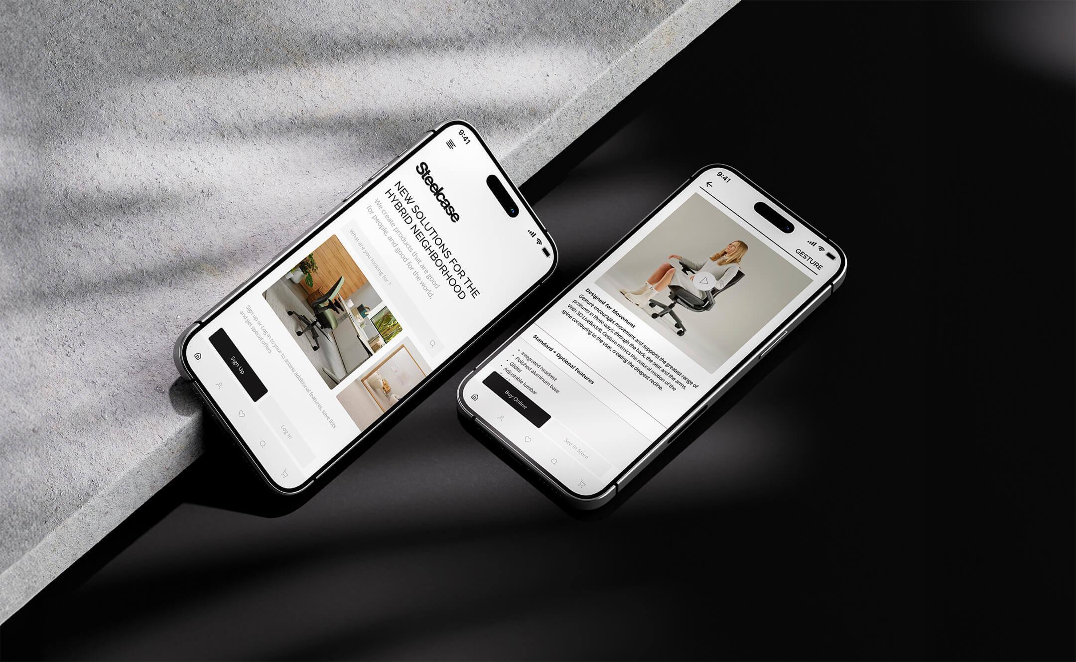
SteelCase
UX/UI & App Design
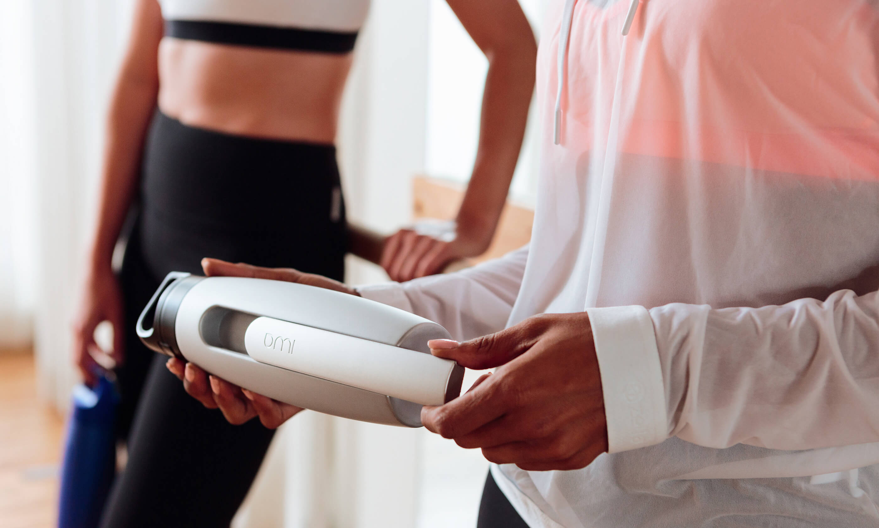
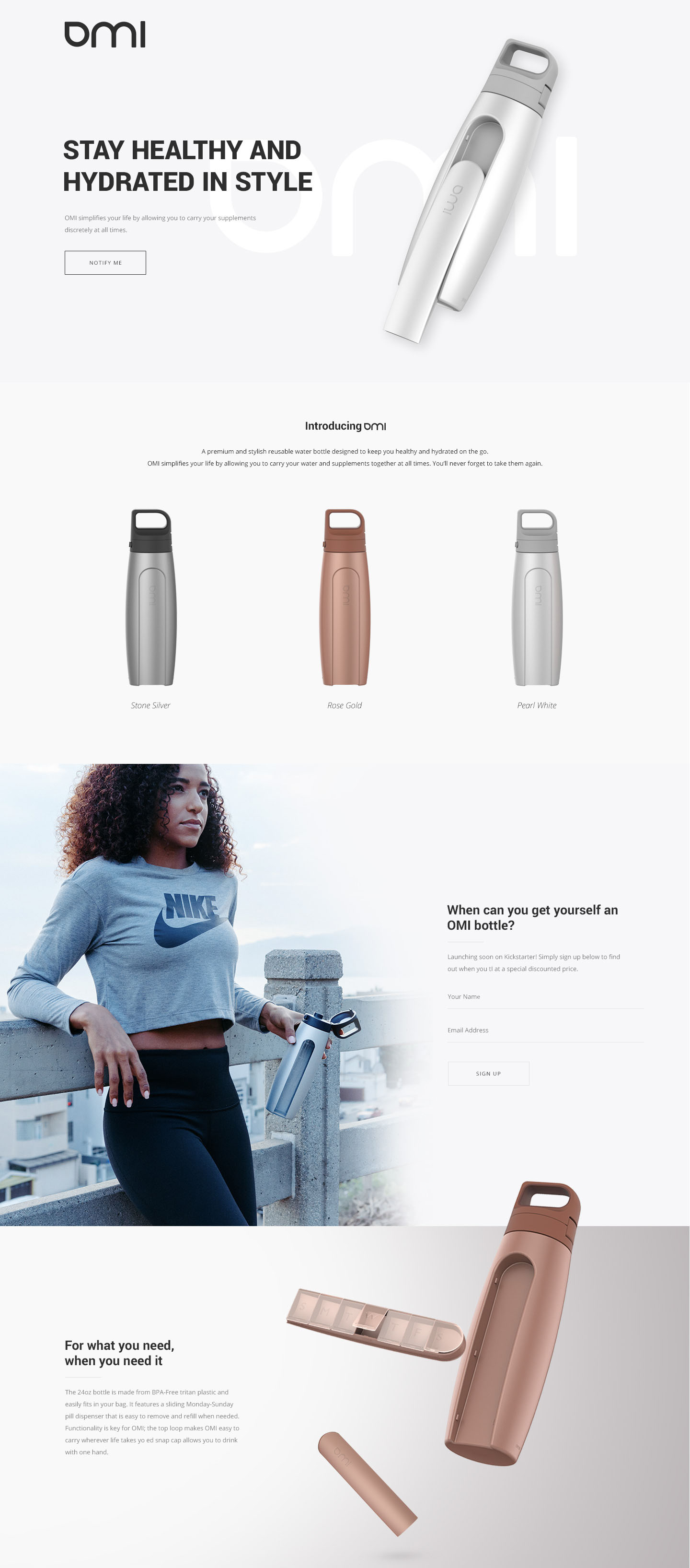
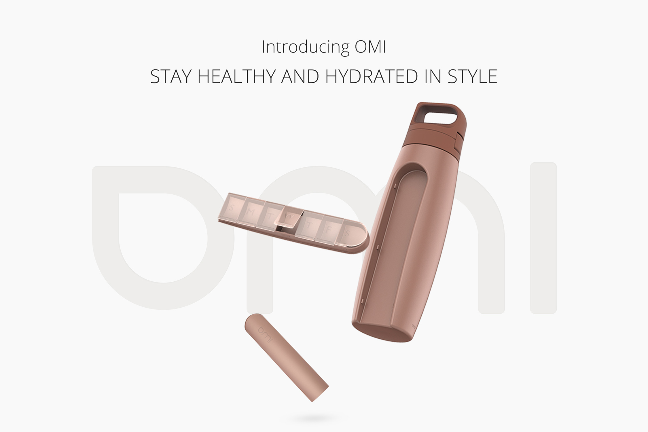
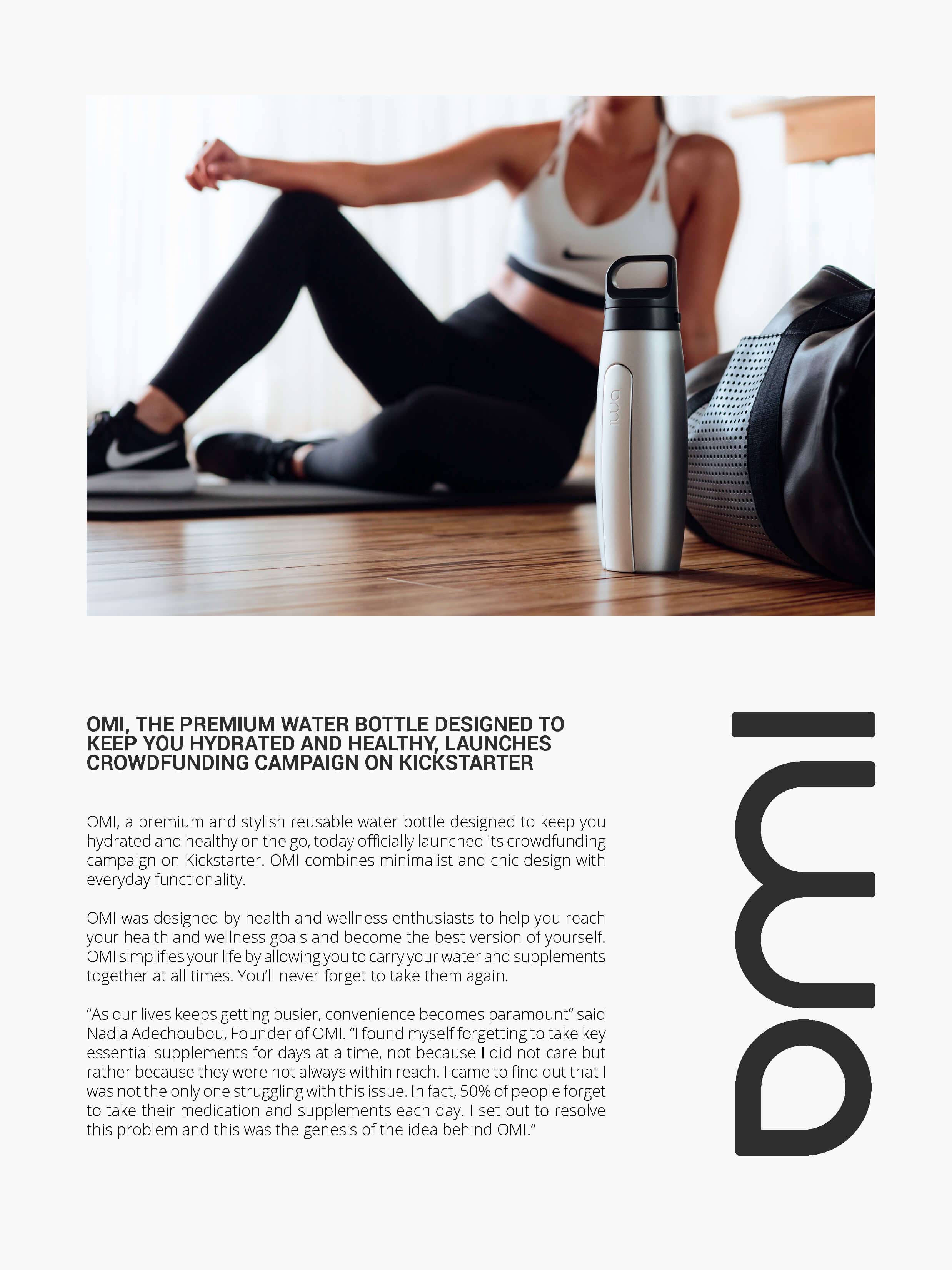
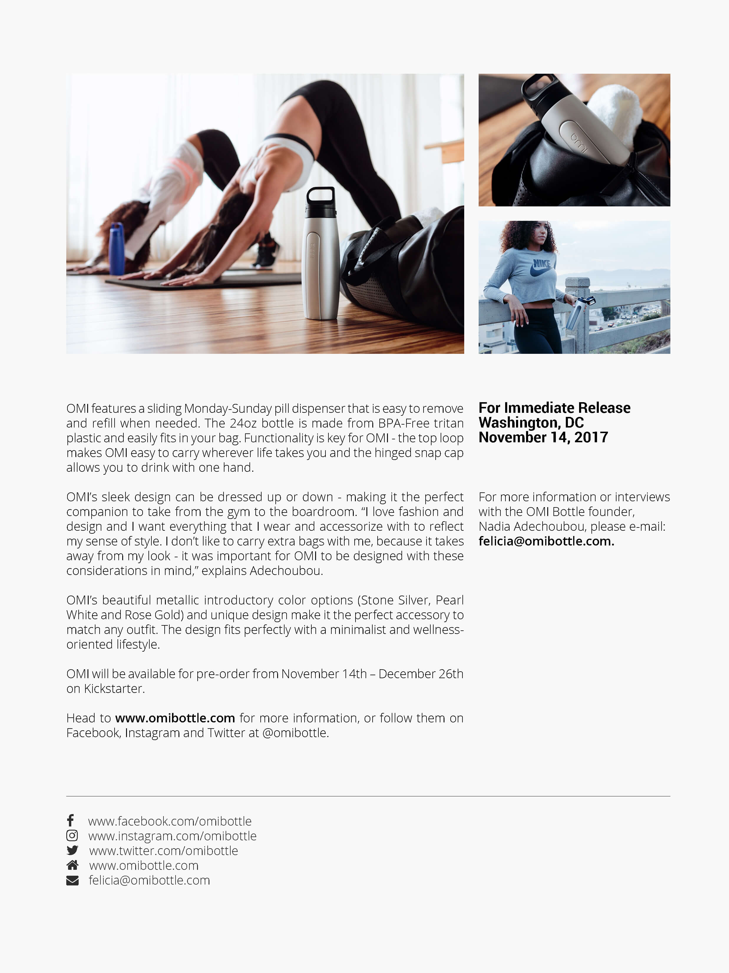
OMI is a premium wellness brand built around the idea that hydration should be intentional, elevated, and beautifully designed. The project encompassed a complete brand identity — from visual language and packaging to digital presence — creating a cohesive system that communicates purity, sophistication, and modern wellness culture.
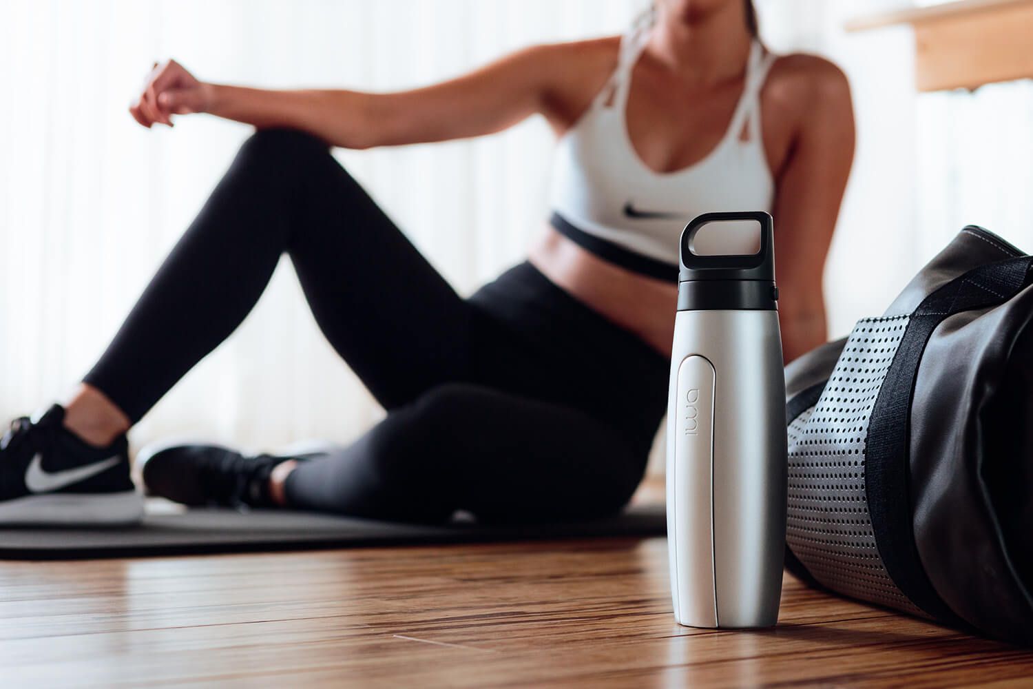
The visual identity was inspired by the concept of essential simplicity — stripping away excess to reveal what matters. A monochromatic palette with selective metallic accents positions OMI in the premium segment, while clean geometric forms and generous negative space communicate the brand's focus on purity and intentional design.
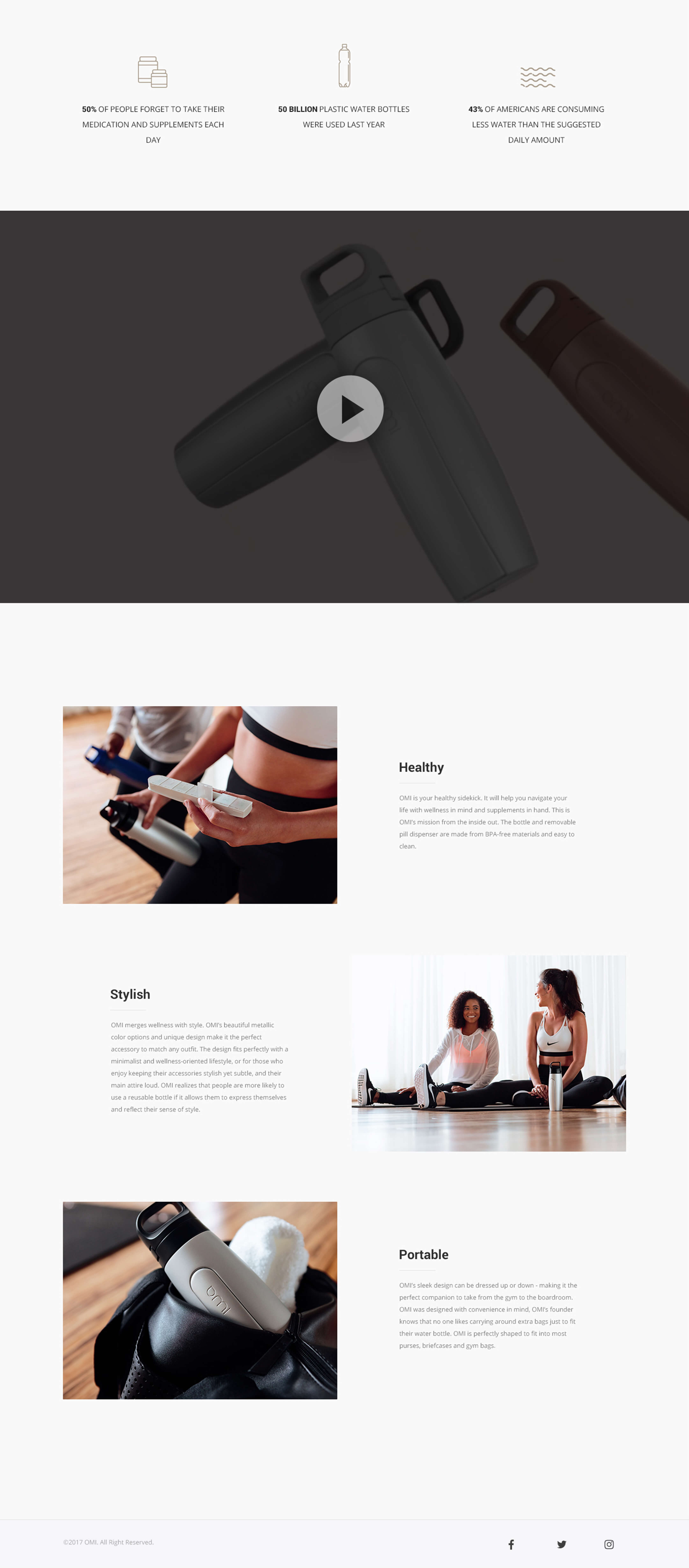
The packaging system was designed to stand out on shelf while maintaining the restrained elegance that defines the brand. Every touchpoint — from bottle labels to marketing collateral — follows a consistent visual grammar that reinforces OMI's positioning as a lifestyle choice, not just a product.
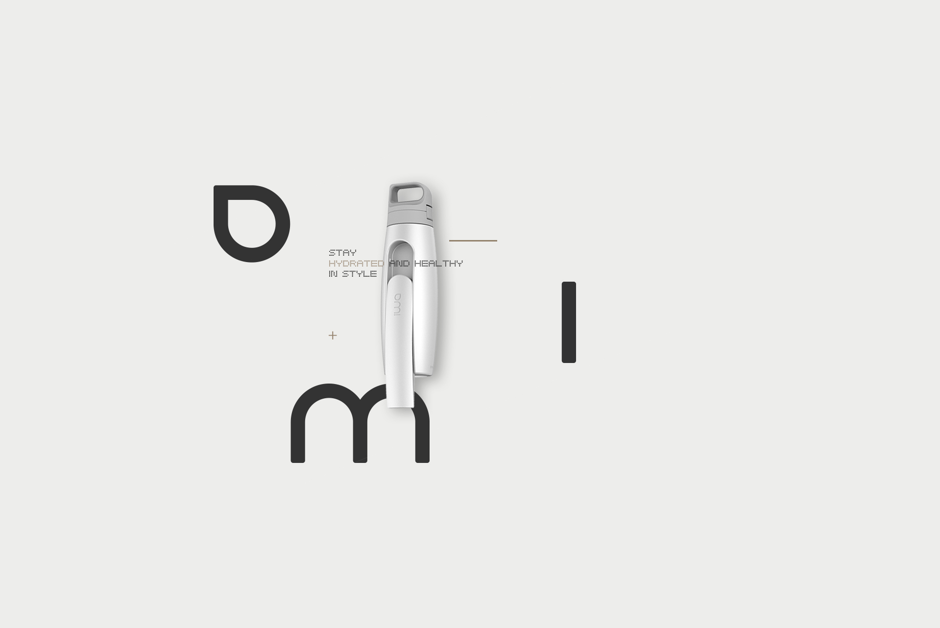
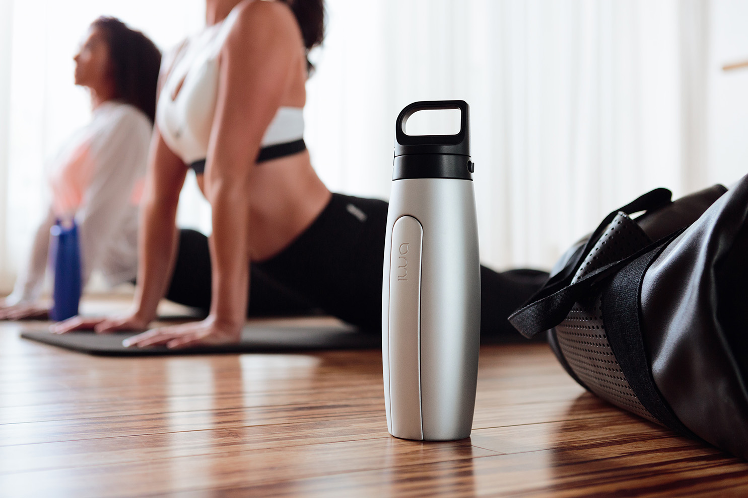
The website extends the brand's physical presence into the digital space, creating an immersive product experience that mirrors the tactile quality of the packaging. The design prioritizes visual storytelling — large-format imagery, smooth scroll interactions, and a carefully paced content flow that lets the product photography take center stage.
The e-commerce integration was designed to feel seamless rather than transactional, with a streamlined purchase flow that maintains the brand's premium positioning throughout the entire customer journey. Every interaction reinforces the idea that choosing OMI is a deliberate, considered decision.